Overview

(1) Created a standardized icon system for Taiwan's Personal Data Protection Commission—for important data privacy concepts and rights, intended for organization-wide adoption.

(2) Wireframed and designed screens for an educational game to train employees on the new icon language, accelerating proficiency. Adapted for both physical and digital, in two languages.
Icon System
Game Design
UX/UI Design
Wireframes
Design System
System Thinking
Interaction Design

Challenge

(1) Turn 27 personal data privacy concepts (that must also be organized into 3 umbrella categories) into professional, approachable, and identifiable icons that cater to Taiwan design preferences

(2) Make learning an entire icon set into a fun and quick-to-grasp game that balances both education and play.

Solution

(1) Research Taiwanese design and culture to explore and establish a style. Create a system of reusable components that can be applied across similar icons for quick pattern identification.

(2) Combine competitive game mechanics, learning scenarios, and engaging uplifting design.

Icon System Research

Deep Dive into Visual Languages

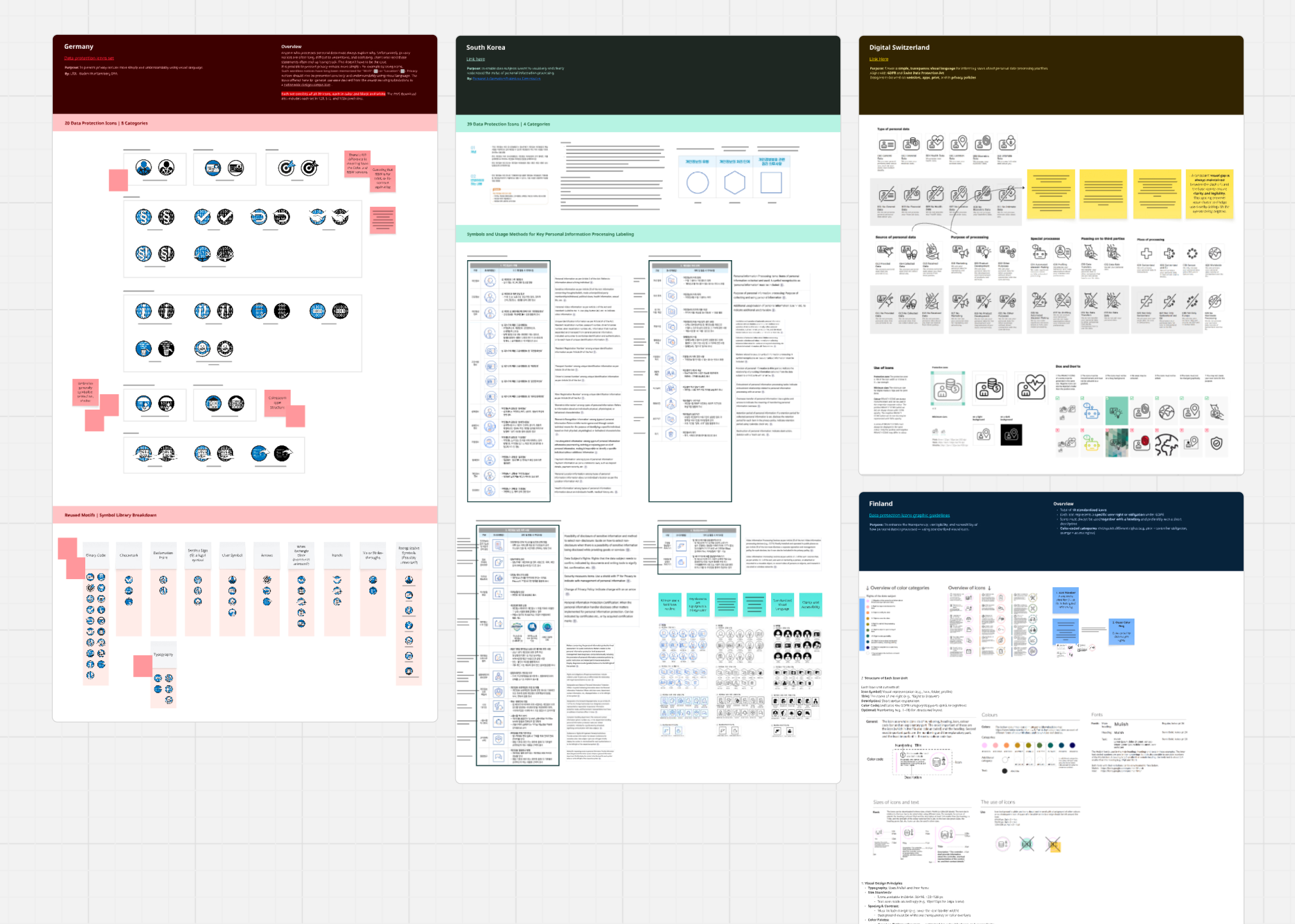
We broke down and analyzed existing privacy icon systems that Taiwan's PDPC team wanted to reference—ones from Finland, Switzerland, Germany, and South Korea. We studied how each country approached their set, and pulled from what worked.

Existing Data Privacy Icon Sets

We broke down and analyzed the existing privacy icon systems that Taiwan's PDPC team wanted to reference—ones from Finland, Switzerland, Germany, and South Korea. We studied how each country approached their set, and pulled from what worked.

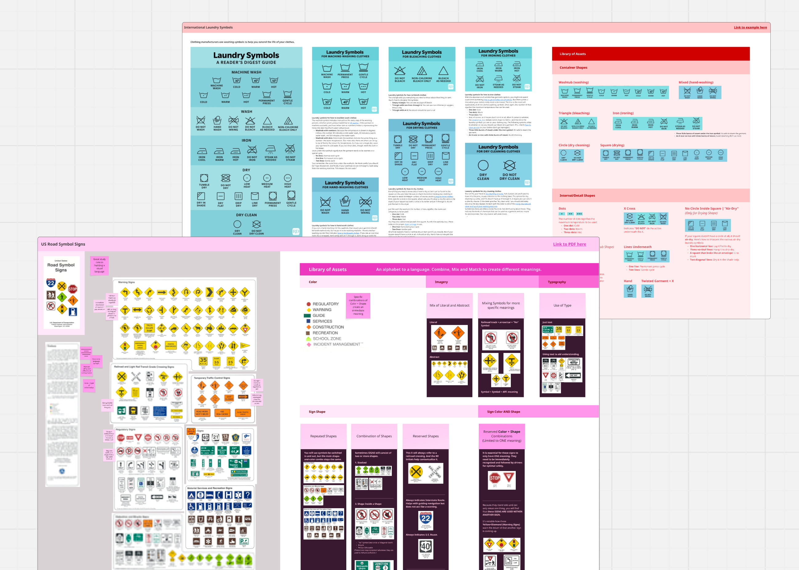
Analyzing Universal/National Language Systems

I selected and studied long-standing visual language usage. What better than universal laundry symboles, and US Road Map signs. The vast information that both these systems break down into sensible visuals lent itself to how I approached PDPC's icons: repeating motifs that hold one-true meaning, and category shapes/colors.

Icon System Design

Rooted in Culture and Structure

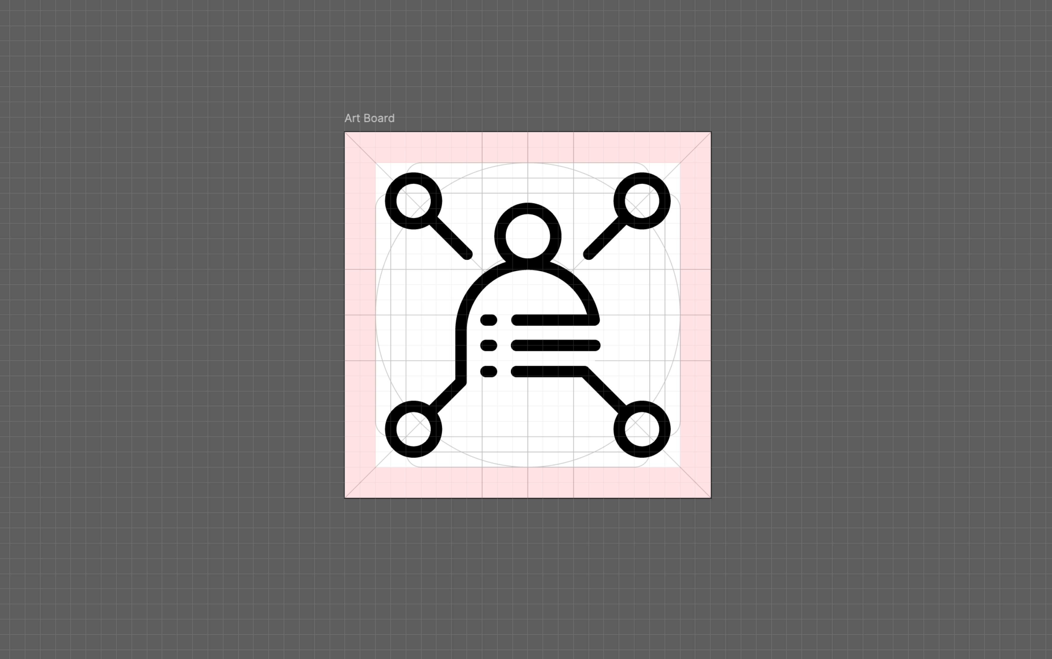
I ensured strong consistency in 2 sectors: by following graphic and color language from Taiwan, and pertaining to the icon grid.

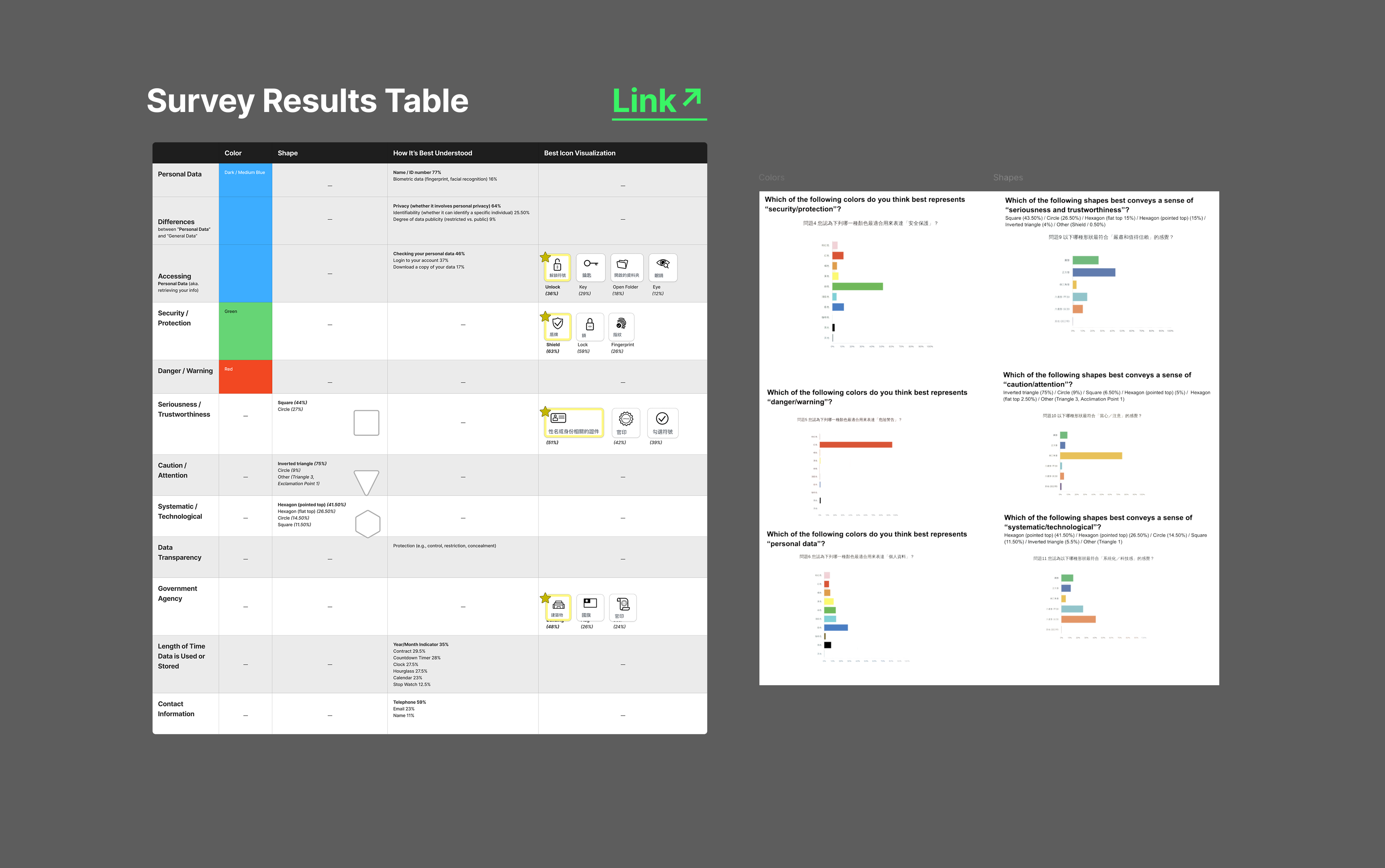
Implementing Survey Results

Shape language and color meanings differ across countries. So to build an icon system that can live naturally in Taiwan, I directly implemented results from the research survey a teammate sent out.

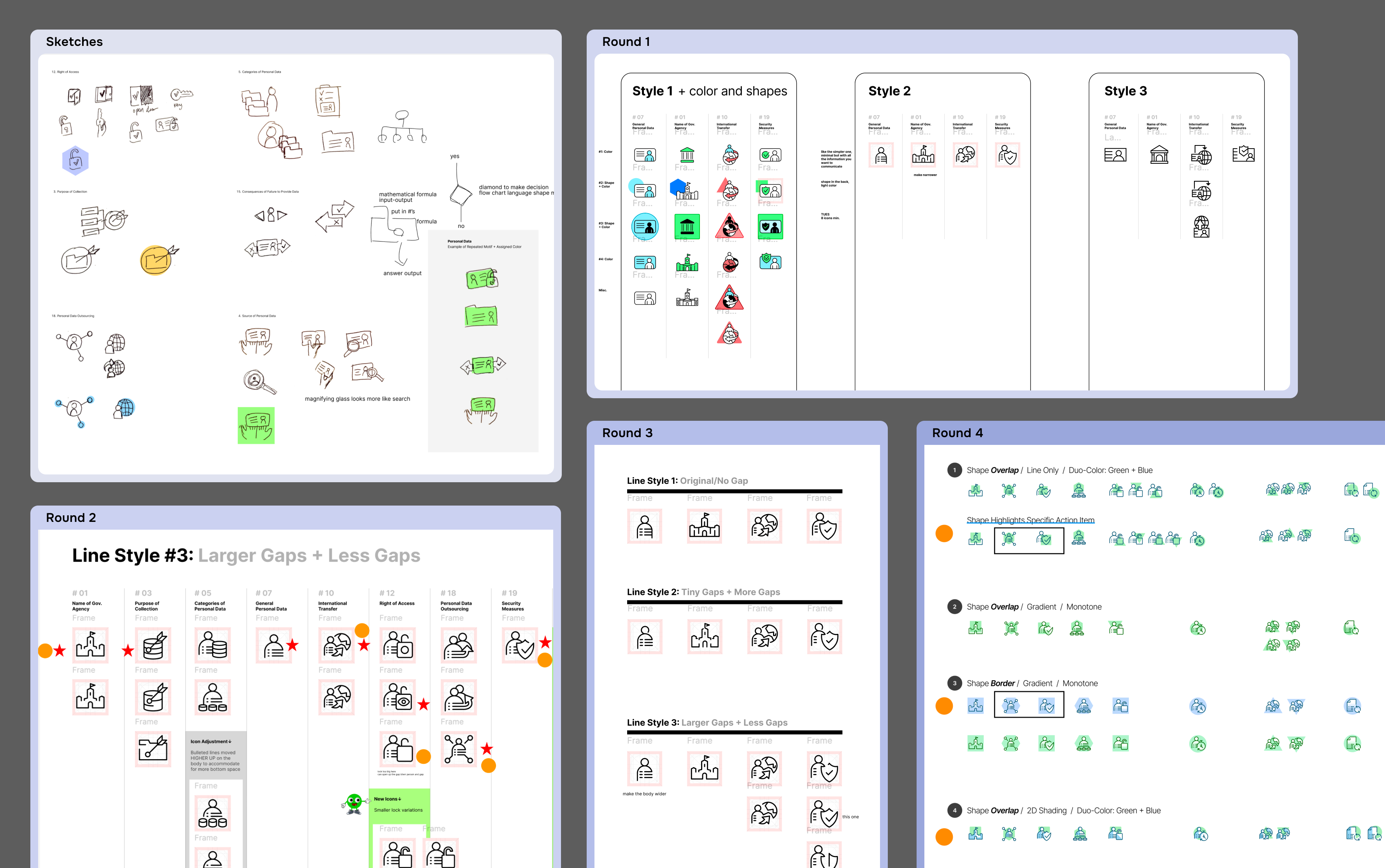
Iterations and Explorations

After each design round, I presented my work and took in feedback until reaching an approved design style.

Grid System

Based on the Design Director's finalized revisions, I translated the physical game board design into digital assets and a cohesive environment.

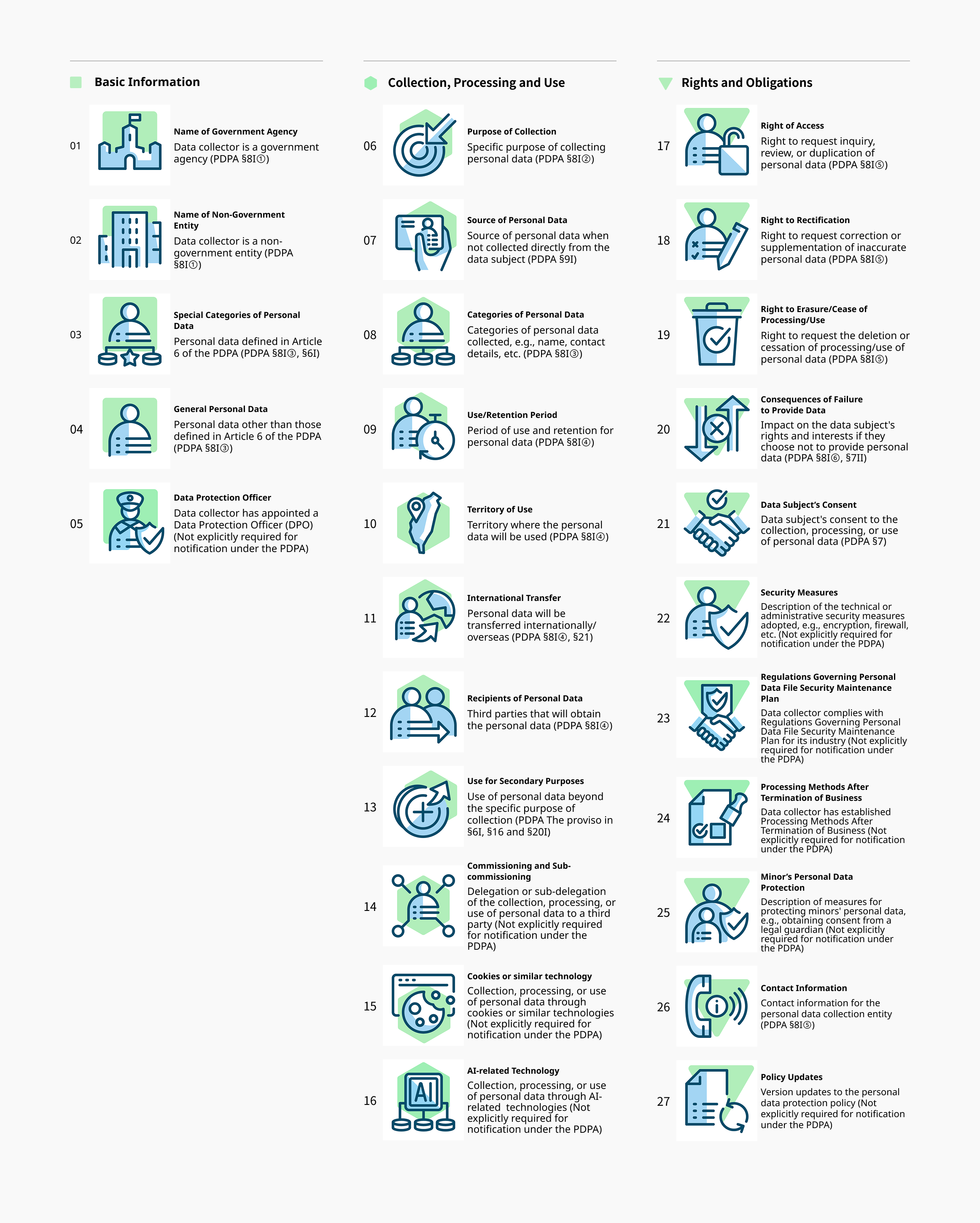
The Full Set

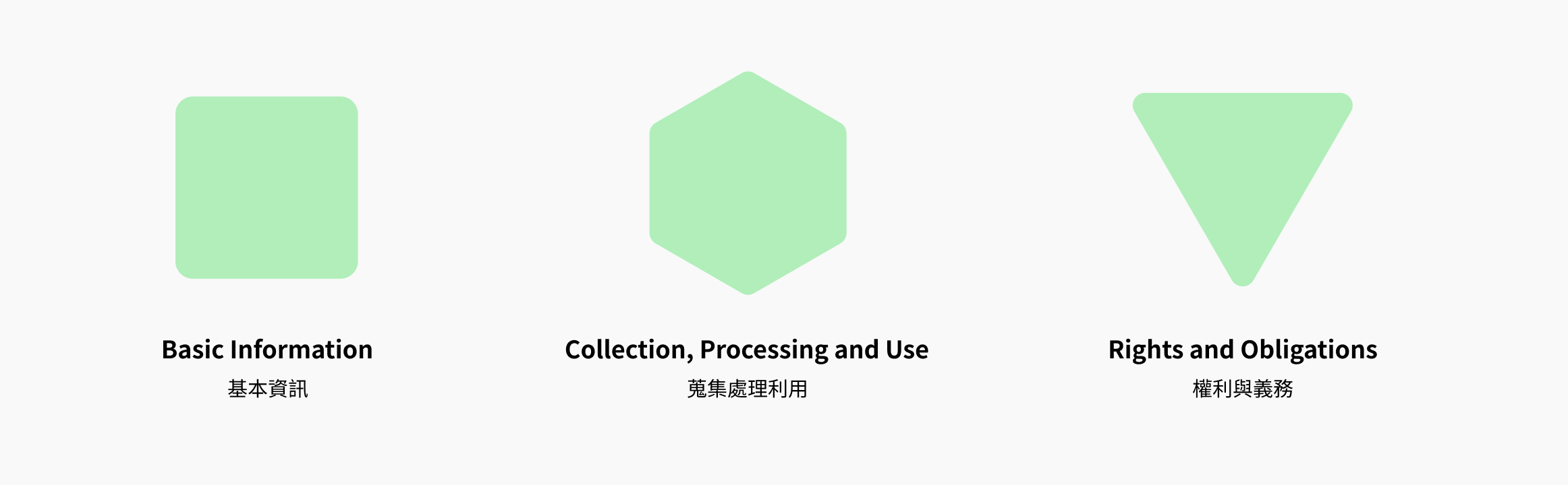
Each icon is it's own entity but belongs to one of the 3 categories. Layering this information—large consistent category shape with the differing imagery on top—helps combine the two elements.

The Game Steps

Creating an Educational Game

To make learning 27 icons fun is a challenge our team had to tackle. A simple flashcard memorization game could suffice, but that is not engaging nor provoking. These are the process steps I participated in:

(1) Ideation

Participated in group brainstorming, coming up with rough concepts to present—remembering to preserve the educational aspect.

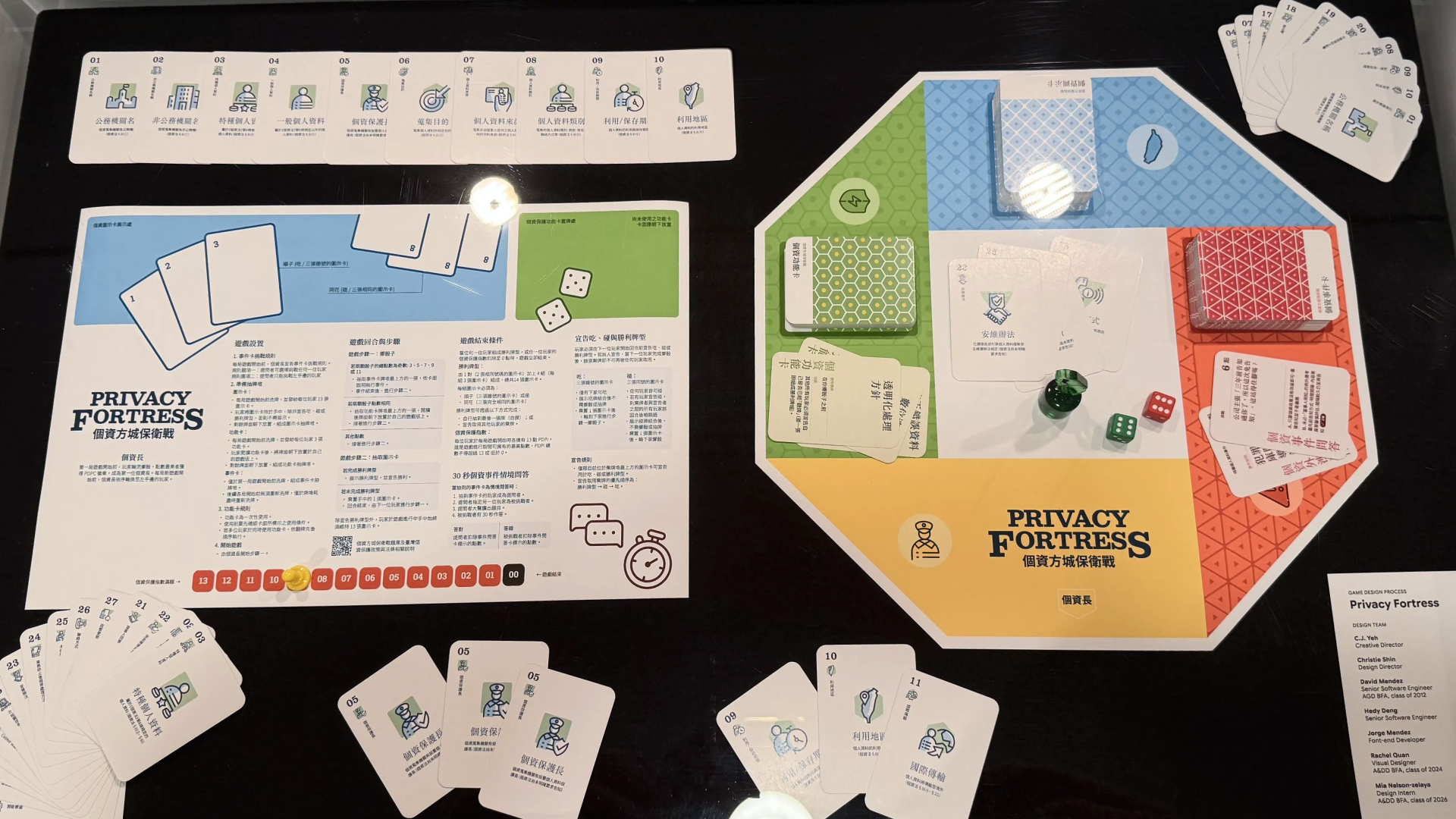
(2) Board Game Design

Given the approved game structure and content, I was tasked to create close-to-final design options. Through iterations and adapting feedback, the Design Directors selected one to push forward.

(3) Translate to Digital

Based on the Design Director's finalized revisions, I translated the physical game board design into digital assets and a cohesive environment.

Digital Game Design

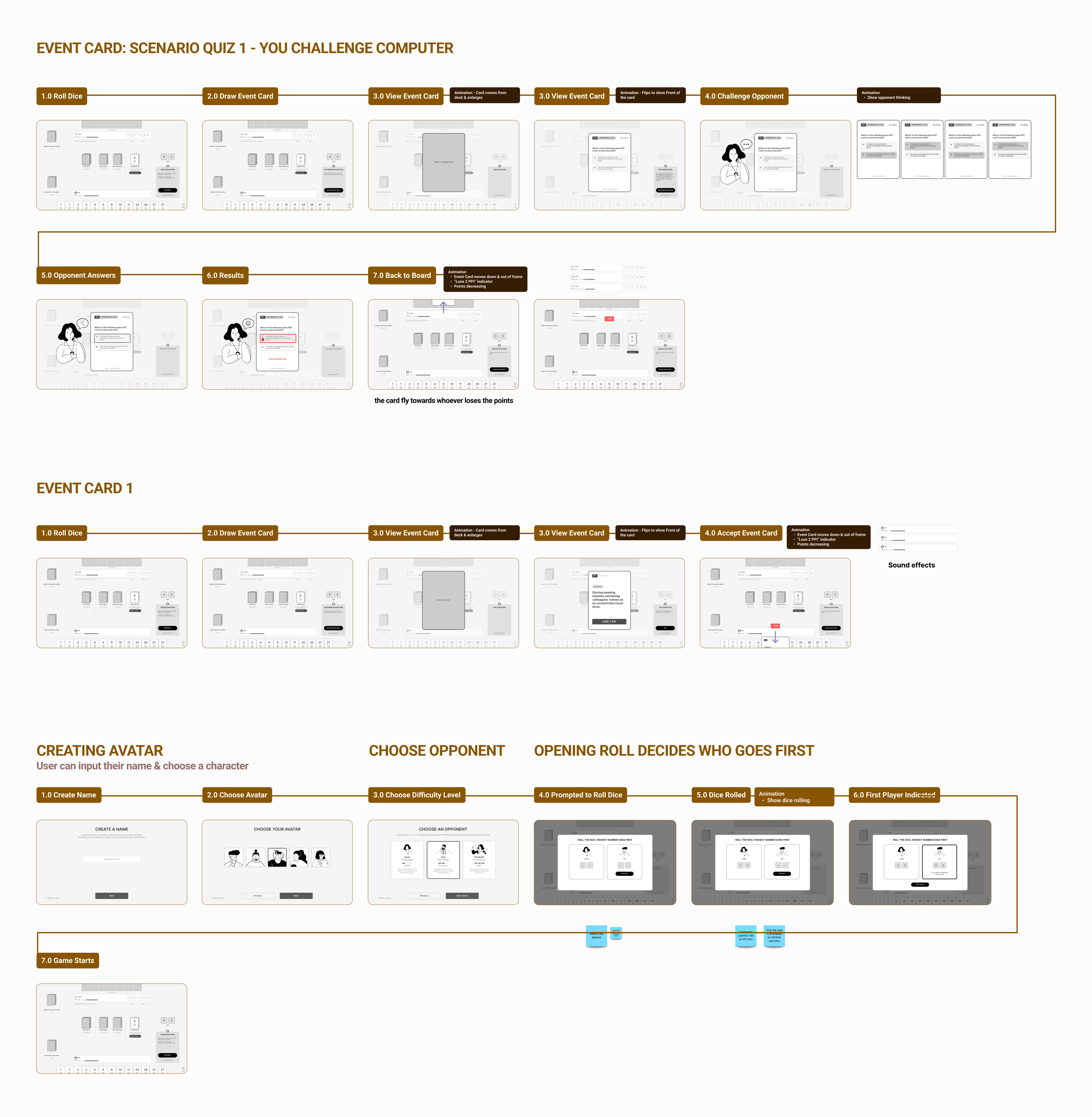
Wireframes

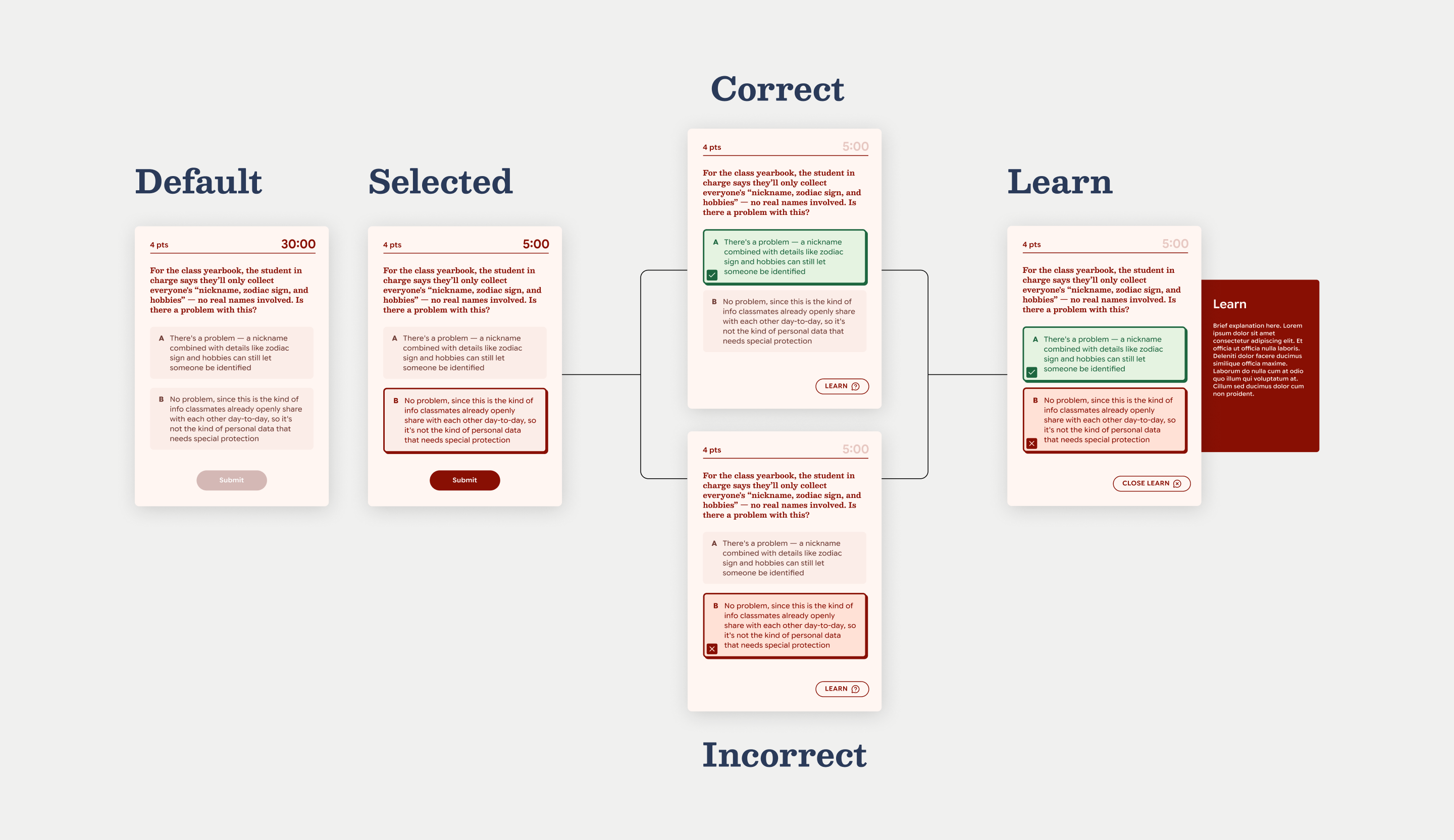
I created wireframes, as well as proposed user flows and interactions. Here are a few examples.

Adapted for the Smallest Screen

To optimize the user experience for all users across different mobile devices, we design for the smallest supported screen.

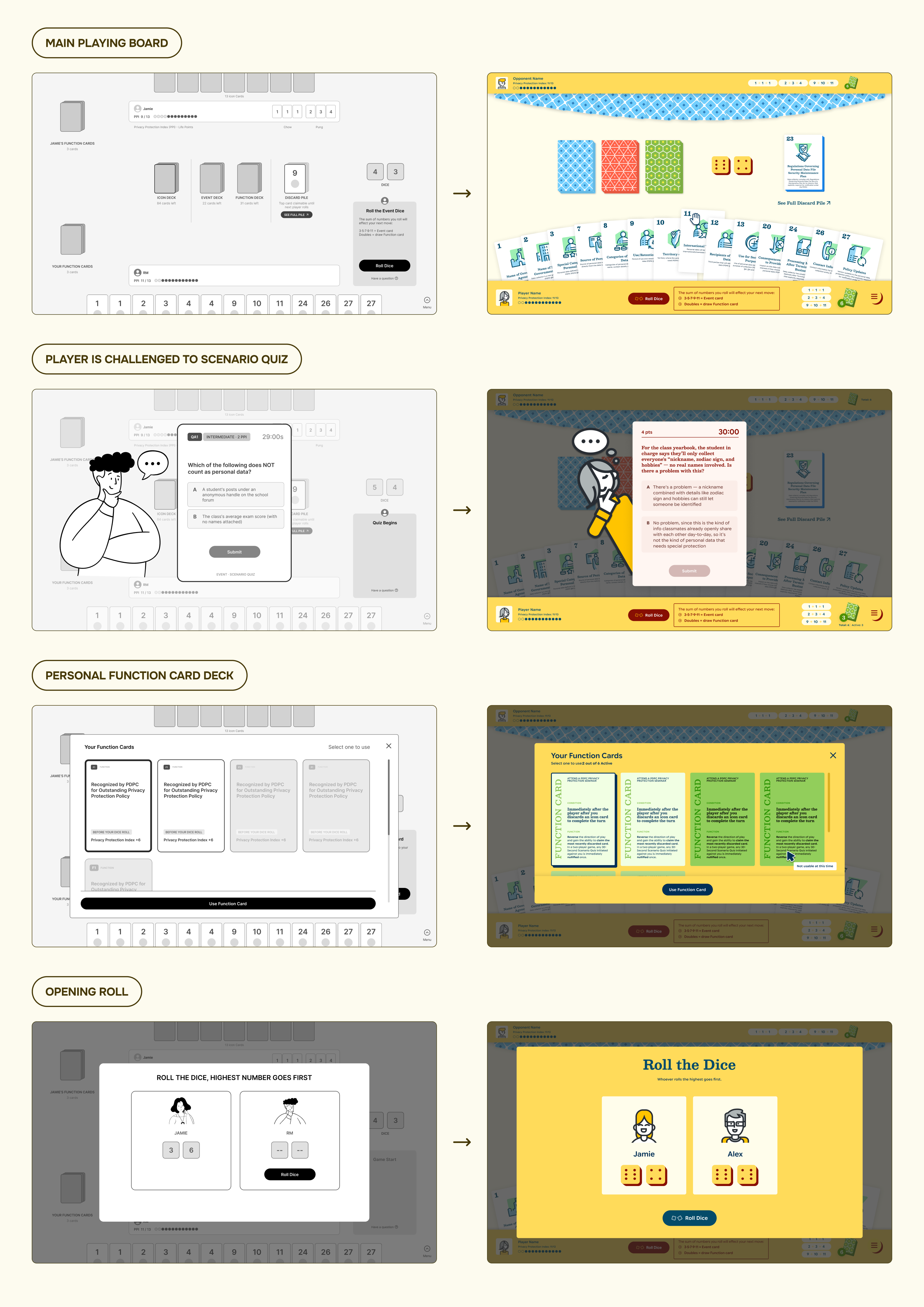
Turning a Physical Game into a Digital One

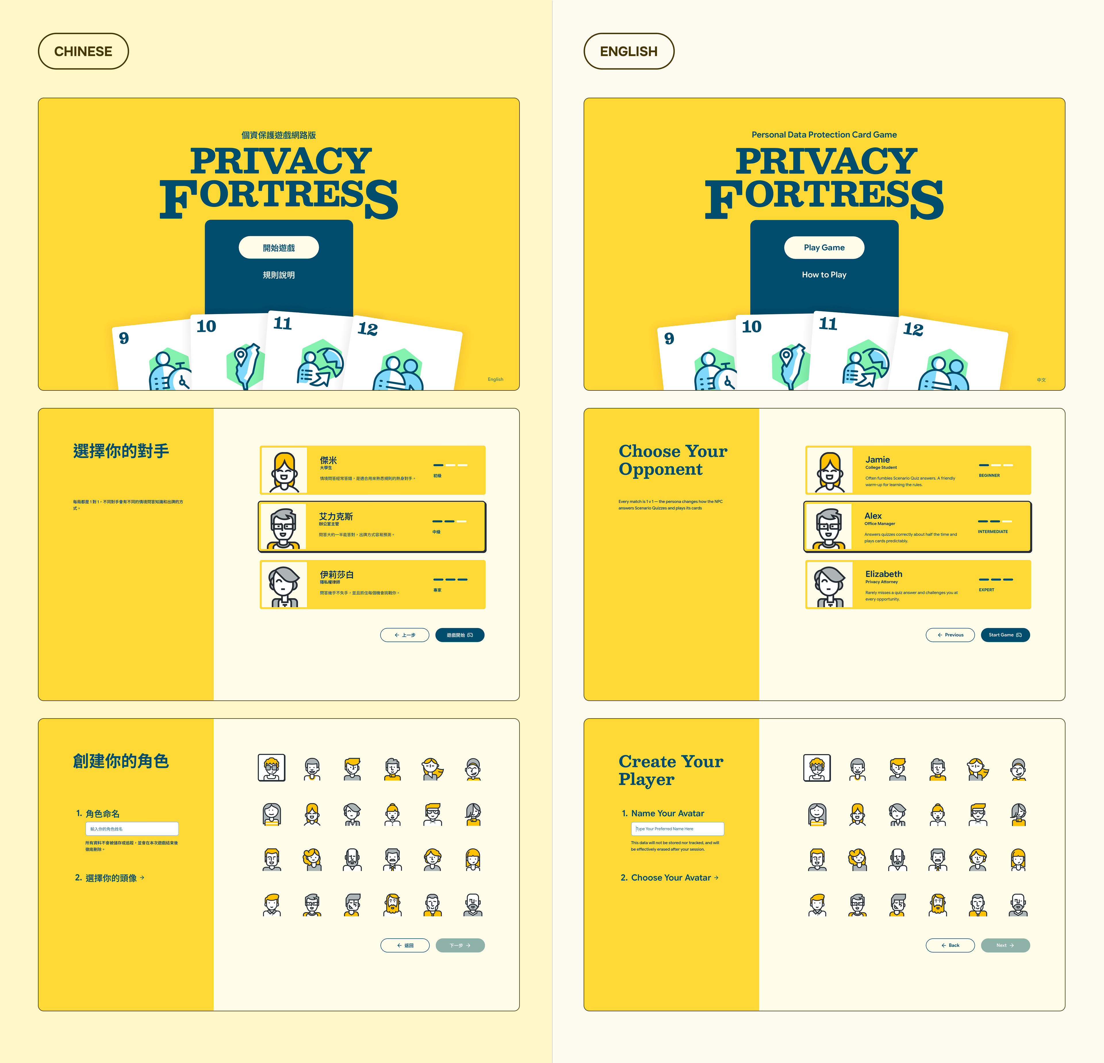
I explored several close-to-final design iterations before the Design Directors decided on one to finalize. I, then, took their finalized design and applied the art direction to the rest of the game screens. Here are some of our designs:

Adapted for the Smallest Screen

To optimize the user experience for all users across different mobile devices, we design for the smallest supported screen.

Adapted in 2 Languages

Playable in Chinese and English—Chinese for Taiwan clients and English for our development and planning.

Adapted for the Smallest Screen

To optimize the user experience for all users across different mobile devices, we design for the smallest supported screen.

Design System

Ready for Devs

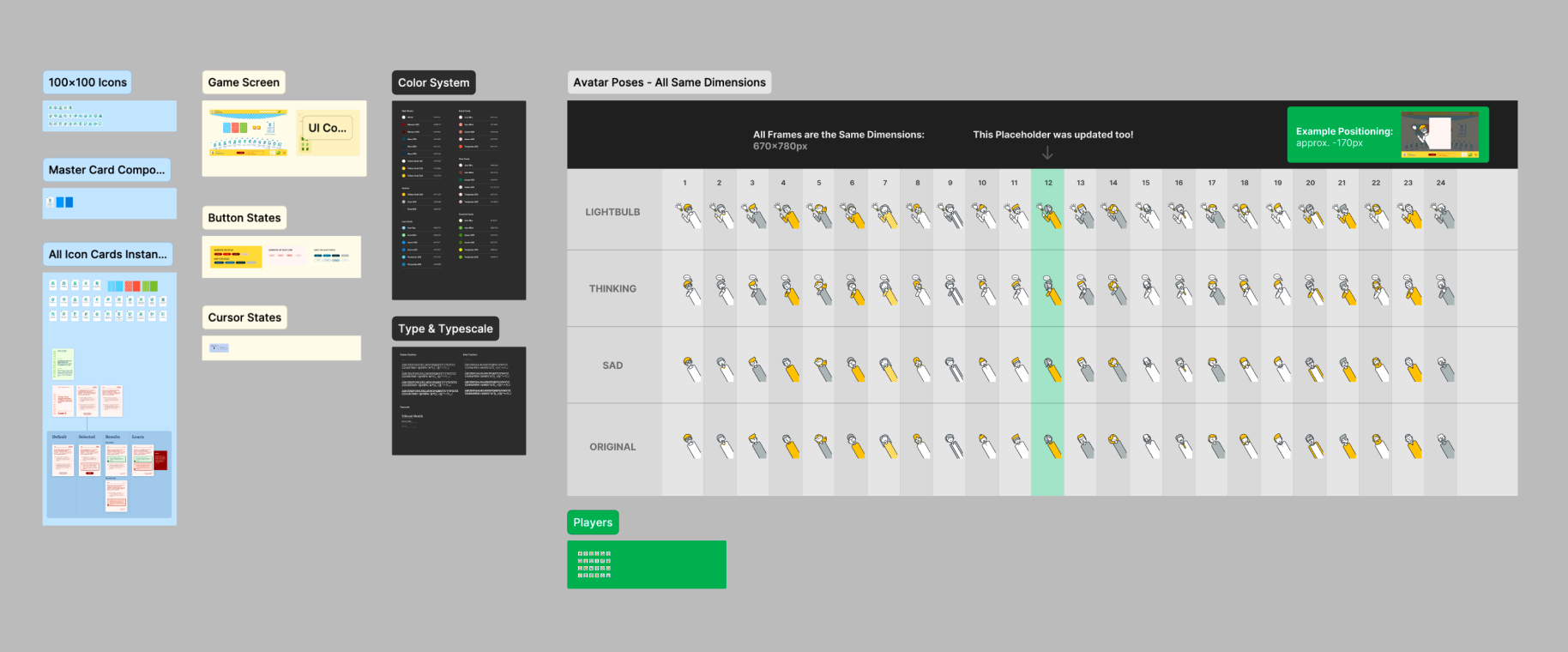
I maintained and organized the game's design system in Figma, ensuring dev-ready assets.

Adapted for the Smallest Screen

To optimize the user experience for all users across different mobile devices, we design for the smallest supported screen.